
The World Happiness Report is an annual publication of the United Nations Sustainable Development Solutions Network that ranks countries by how happy their citizens perceive themselves to be.
The report is based on surveys that ask people to rate their own well-being on a scale of 0 to 10. The report also includes a chapter on the state of happiness in the world and an analysis of the data from various perspectives, including by gender, age, and region.
Additionally, The World Happiness Report ranks countries by factors that contribute to happiness such as income, social support, healthy life expectancy, freedom to make life choices, trust, and generosity. The first World Happiness Report was released in 2012, and it has been published annually since then.
This project analyzes the 2021 World Happiness Report to draw conclusions about the general well being of 148 countries in the world. This project does some basic data wrangling and exploratory data analysis.
Lets import libraries.
import numpy as np
import pandas as pd
import matplotlib.pyplot as plt
%matplotlib inline
import seaborn as sns
We will then load and read our dataset.
df = pd.read_csv('/content/world-happiness-report-2021.csv')
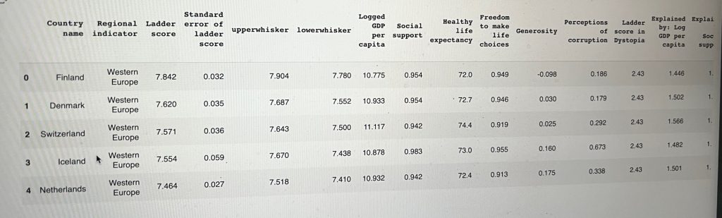
Here’s a slice of the table. These countries are sorted by their happiness scores, with values for each of the variables.
df.head()
I wanted to know how many observations are in the dataset. So I used the .shape attribute to give me the amount of rows and columns.
df.shape

(149, 20)
We need to understand our data more.
To display information about a DataFrame, including the number of rows and columns, the data types of each column, and the amount of memory used by the DataFrame. It also shows the number of non-null values in each column.
df.info()

<class 'pandas.core.frame.DataFrame'>
RangeIndex: 149 entries, 0 to 148
Data columns (total 20 columns):
 #   Column                                      Non-Null Count  Dtype
---  ------                                      --------------  -----
 0   Country name                                149 non-null    object
 1   Regional indicator                          149 non-null    object
 2   Ladder score                                149 non-null    float64
 3   Standard error of ladder score              149 non-null    float64
 4   upperwhisker                                149 non-null    float64
 5   lowerwhisker                                149 non-null    float64
 6   Logged GDP per capita                       149 non-null    float64
 7   Social support                              149 non-null    float64
 8   Healthy life expectancy                     149 non-null    float64
 9   Freedom to make life choices                149 non-null    float64
 10  Generosity                                  149 non-null    float64
 11  Perceptions of corruption                   149 non-null    float64
 12  Ladder score in Dystopia                    149 non-null    float64
 13  Explained by: Log GDP per capita            149 non-null    float64
 14  Explained by: Social support                149 non-null    float64
 15  Explained by: Healthy life expectancy       149 non-null    float64
 16  Explained by: Freedom to make life choices  149 non-null    float64
 17  Explained by: Generosity                    149 non-null    float64
 18  Explained by: Perceptions of corruption     149 non-null    float64
 19  Dystopia + residual                         149 non-null    float64
dtypes: float64(18), object(2)
memory usage: 23.4+ KB
What are the data types in this dataset? Do they make sense?
df.dtypes

Country name                                   object
Regional indicator                             object
Ladder score                                  float64
Standard error of ladder score                float64
upperwhisker                                  float64
lowerwhisker                                  float64
Logged GDP per capita                         float64
Social support                                float64
Healthy life expectancy                       float64
Freedom to make life choices                  float64
Generosity                                    float64
Perceptions of corruption                     float64
Ladder score in Dystopia                      float64
Explained by: Log GDP per capita              float64
Explained by: Social support                  float64
Explained by: Healthy life expectancy         float64
Explained by: Freedom to make life choices    float64
Explained by: Generosity                      float64
Explained by: Perceptions of corruption       float64
Dystopia + residual                           float64
dtype: object
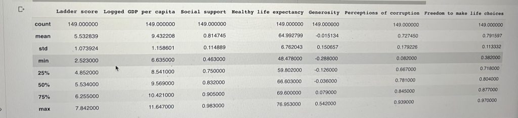
We also need to generate a descriptive statistic of our data’s columns. The describe() method returns a new DataFrame containing various statistics such as the count, mean, standard deviation, minimum, and maximum value of each.
df.describe()

Is our data clean?
We will drop the statistical columns and the “Explained by: ” columns since these have no direct impact on the total score reported for each country, but instead are just a way of explaining for each country the implications/contribution of these variables to the Ladder Score.
new_df = df.drop(columns=['Standard error of ladder score', 'upperwhisker', 'lowerwhisker', 'Ladder score in Dystopia', 'Explained by: Log GDP per capita', 'Explained by: Social support', 'Explained by: Healthy life expectancy', 'Explained by: Freedom to make life choices','Explained by: Generosity', 'Explained by: Perceptions of corruption', 'Dystopia + residual'])
We can check for any null values.
new_df.isnull().sum()

Country name                    0
Regional indicator              0
Ladder score                    0
Logged GDP per capita           0
Social support                  0
Healthy life expectancy         0
Freedom to make life choices    0
Generosity                      0
Perceptions of corruption       0
dtype: int64
or even for any duplicates.
new_df.duplicated().sum()

0
We can generate the frequency distribution of unique values in our data using the regional indicator columns. A new Series containing the count of unique values in descending order is the result.
new_df['Regional indicator'].value_counts()


Sub-Saharan Africa                    36
Western Europe                        21
Latin America and Caribbean           20
Middle East and North Africa          17
Central and Eastern Europe            17
Commonwealth of Independent States    12
Southeast Asia                         9
South Asia                             7
East Asia                              6
North America and ANZ                  4
Name: Regional indicator, dtype: int64
Data Analysis
Are the minimum and maximum happiness Ladder scores reasonable? Are there any outliers?
df['Ladder score'].max()
7.842
df['Ladder score'].min()
2.523
The happiness Ladder scores appears reasonable since all the scores range between 1 and 8.
Now can we get the average happiness score for all countrie?
df['Ladder score'].mean()
5.532838926174497
cont_data = new_df[['Ladder score', 'Logged GDP per capita', 'Social support', 'Healthy life expectancy', 'Generosity', 'Perceptions of corruption', 'Freedom to make life choices']].describe()
cont_data
Is there any correlation between the features?
I’m going to use happiness Score as the target since the other features explain it.
correlation = new_df.corr('pearson')
correlation
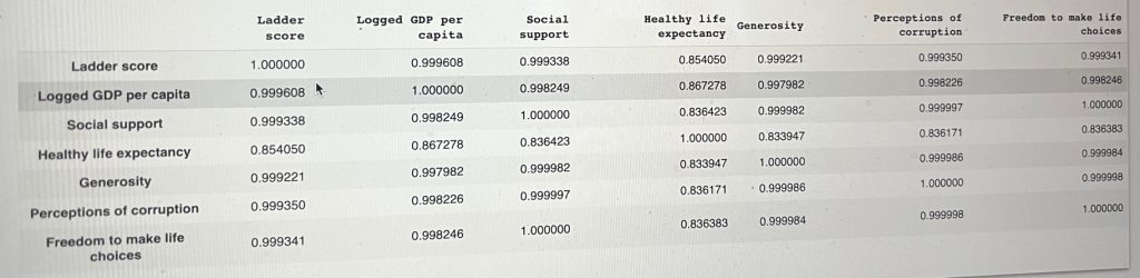
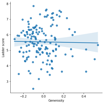
abs(correlation['Ladder score'].sort_values(ascending=False))

Ladder score                    1.000000
Logged GDP per capita           0.789760
Healthy life expectancy         0.768099
Social support                  0.756888
Freedom to make life choices    0.607753
Generosity                      0.017799
Perceptions of corruption       0.421140
Name: Ladder score, dtype: float64
Logged GDP, Healthy life expectancy and Social support are highly correlated with Ladder score for happiness. This means that if I wanted perform a predictive analysis, I could play around with some regression models using these four features to predict the target, Happiness Scores.
Univariate analysis of continuous variables.
A histogram in Pandas shows the frequency distribution of a numerical variable.
How is happiness score distributed in this study?
sns.displot(df['Ladder score'], kde = True)
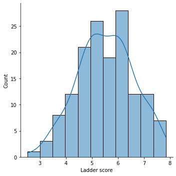
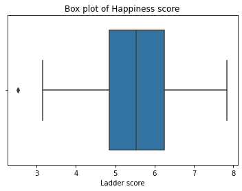
We can notice a lowest possible score of around 2.5 to a high of 7.8
A box plot (also known as a box-and-whisker plot) in Pandas is a standardised way of displaying the distribution of a dataset. It is a graphical representation of the distribution of a dataset, where the box represents the interquartile range (IQR) of the data, which is the range between the first and third quartiles (25th and 75th percentiles). The whiskers extend from the box to the minimum and maximum values, excluding outliers. Outliers are defined as observations that fall outside of 1.5 times the IQR from the lower and upper quartiles.
sns.boxplot(df['Ladder score'] ).set_title('Box plot of Happiness score')
plt.show()
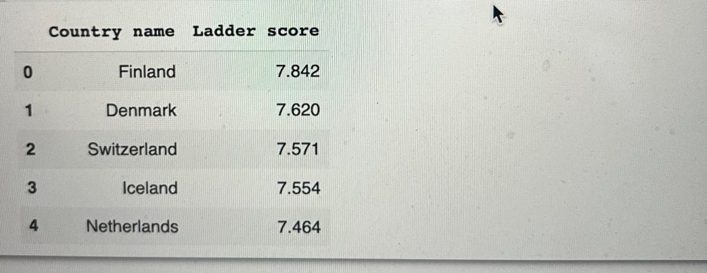
By using loc to select columns, here is the top five happiest countries.
top_happy = df.loc[:4, ['Country name', 'Ladder score']]
top_happy
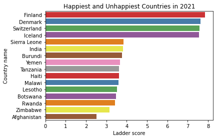
df2021_happiest_unhappiest = df[(df.loc[:, "Ladder score"] > 7.5) | (df.loc[:, "Ladder score"] < 4)]
sns.barplot(x = "Ladder score", y = "Country name", data = df2021_happiest_unhappiest, palette = "Set1")
plt.title("Happiest and Unhappiest Countries in 2021")
plt.show()
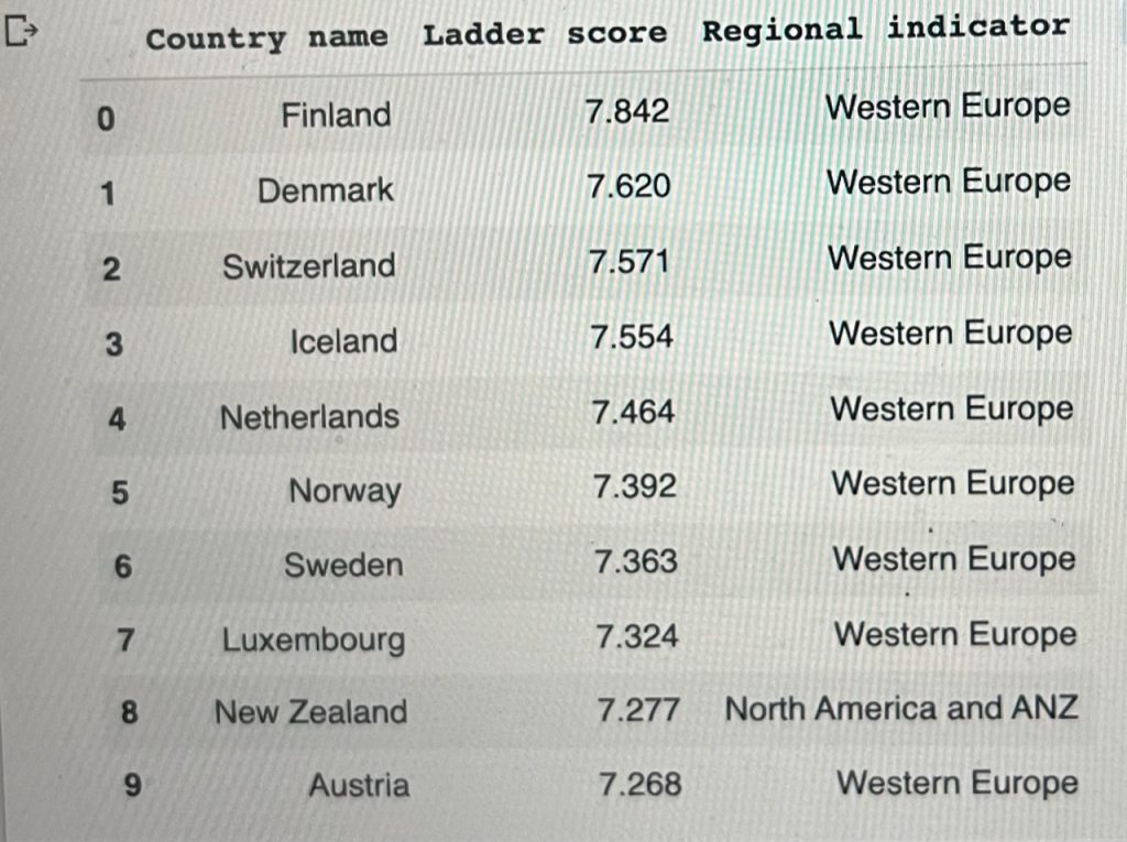
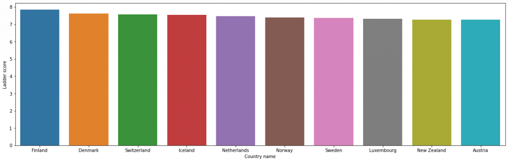
The top highest happiness Ladder score belongs to Finland with 7.842, followed by Denmark and others.
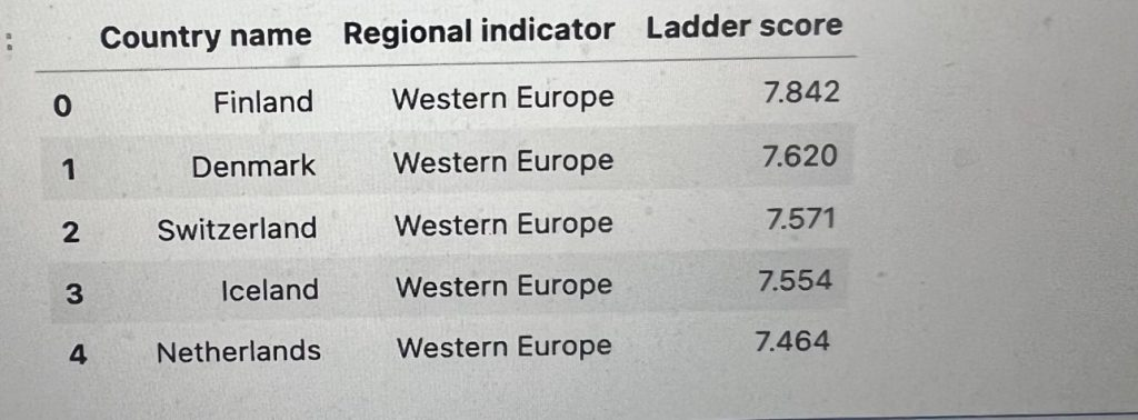
All western European countries.
df.loc[:, ['Country name', 'Regional indicator', 'Ladder score']].head()
This is how the happiest country looks like.
df.loc[0]

Country name                                         Finland
Regional indicator                            Western Europe
Ladder score                                           7.842
Standard error of ladder score                         0.032
upperwhisker                                           7.904
lowerwhisker                                            7.78
Logged GDP per capita                                 10.775
Social support                                         0.954
Healthy life expectancy                                 72.0
Freedom to make life choices                           0.949
Generosity                                            -0.098
Perceptions of corruption                              0.186
Ladder score in Dystopia                                2.43
Explained by: Log GDP per capita                       1.446
Explained by: Social support                           1.106
Explained by: Healthy life expectancy                  0.741
Explained by: Freedom to make life choices             0.691
Explained by: Generosity                               0.124
Explained by: Perceptions of corruption                0.481
Dystopia + residual                                    3.253
Name: 0, dtype: object
Finland has a pretty high value for Social Support, Healthy Life Expectancy and Freedom to Make Life Choices when compared to the maximum. It has a fairly low score for Perceptions of Corruption when compared to the minimum. While this does not determine Finland’s score, it may explain why they score the highest Happiness score in the world.
Pretty good reason why its at the top.
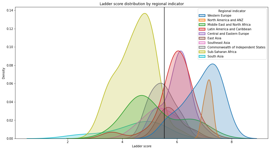
This is how happiness is distributed by Regional.
plt.figure(figsize = (15,8))
sns.kdeplot(df["Ladder score"], hue = df["Regional indicator"], fill = True, linewidth = 2)
plt.axvline(df["Ladder score"].mean(), c = "black")
plt.title("Ladder score distribution by regional indicator")
plt.show()
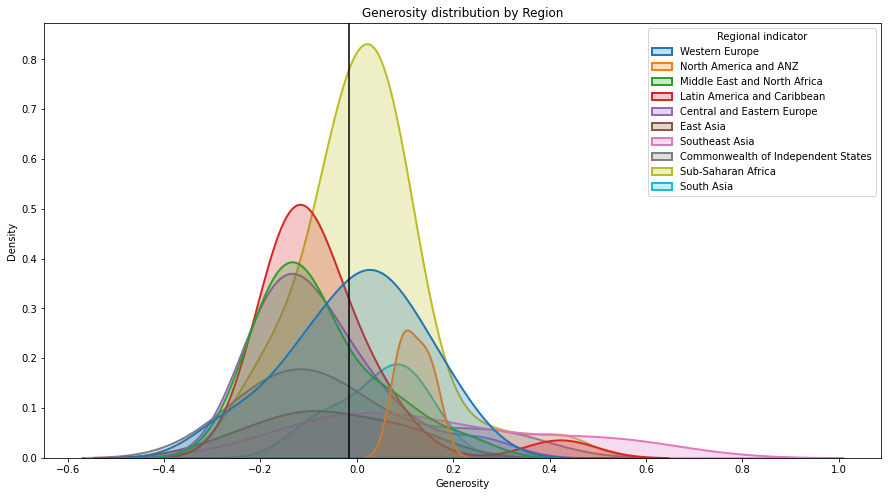
plt.figure(figsize = (15,8))
sns.kdeplot(df["Generosity"], hue = df["Regional indicator"], fill = True, linewidth = 2)
plt.axvline(df["Generosity"].mean(), c = "black")
plt.title("Generosity distribution by Region")
plt.show()
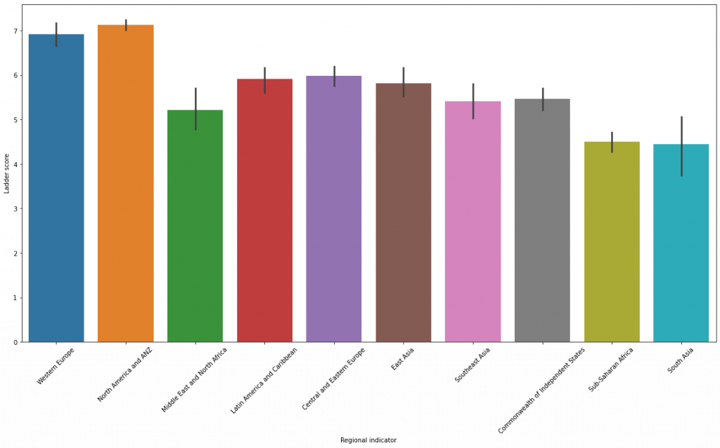
plt.figure(figsize=(20,10))
sns.barplot(data=df, x='Regional indicator',y='Ladder score')
plt.xticks(rotation=45)
cont_data.corr()
The above shows a correlation of all the continuous data in our dataset.
We notice how highly correlated most of the data is to each other. GDP is highly correlated to social support. We can read that countries with higher GDP can afford social support for their populations.
The freedom to make life choices also seems to highly correlate with social support
To look at the relationships between happiness scores and the other measurements, I created scatterplots.
sns.scatterplot(df['Logged GDP per capita'], df['Ladder score'])
plt.ylim(0,)
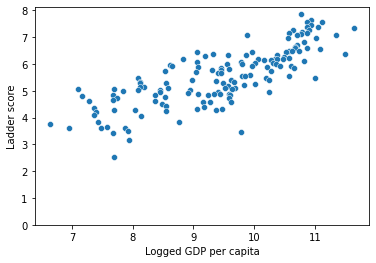
sns.lmplot('Logged GDP per capita', 'Ladder score', data = df)
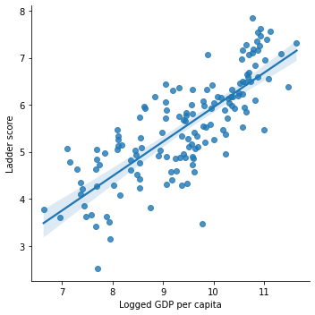
Logged GDP has a positive linear association with happiness scores
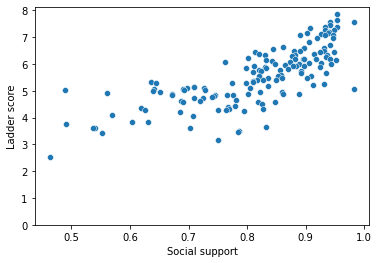
sns.scatterplot(df['Social support'], df['Ladder score'])
plt.ylim(0, )
sns.lmplot('Social support', 'Ladder score', data = df)
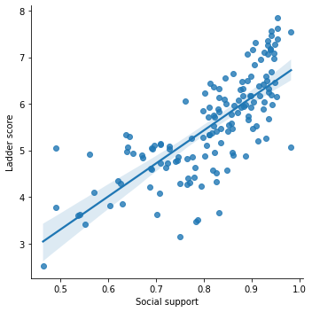
Social support has a positive linear association with happiness scores
sns.scatterplot(df['Healthy life expectancy'], df['Ladder score'])
plt.ylim(0,)
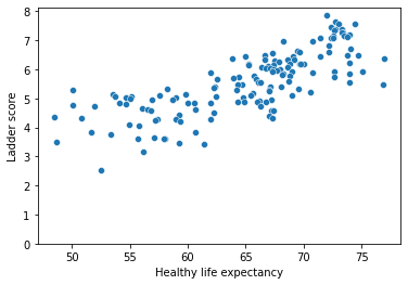
sns.lmplot('Healthy life expectancy', 'Ladder score', data = df)
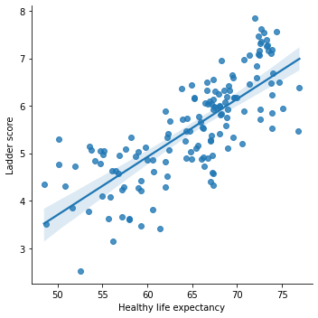
Healthy life expectancy has a positive linear association with happiness Ladder score
sns.scatterplot(df['Generosity'], df['Ladder score'])
plt.ylim(0,)
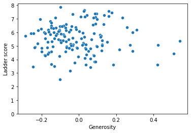
sns.lmplot('Generosity', 'Ladder score', data = df)
sns.scatterplot(df['Perceptions of corruption'], df['Ladder score'])
plt.ylim(0,)
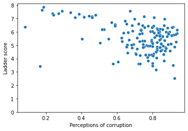
sns.lmplot('Perceptions of corruption', 'Ladder score', data = df)
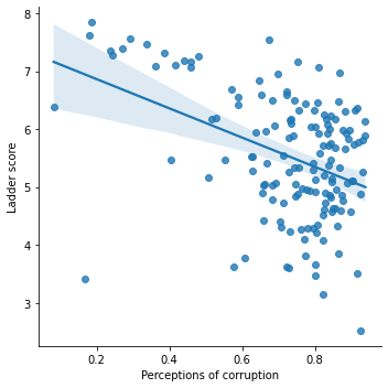
Perceptions of corruption has a negative linear association with the happiness Ladder score.
sns.scatterplot(df['Freedom to make life choices'], df['Ladder score'])
plt.ylim(0,)
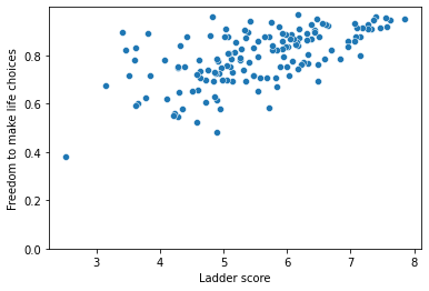
sns.lmplot('Freedom to make life choices', 'Ladder score', data = df)
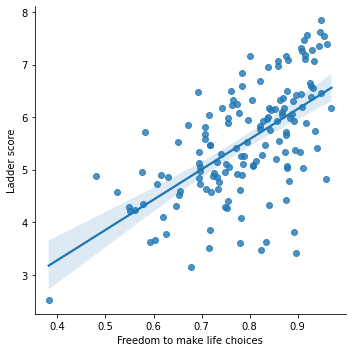
Freedom to make life choices has a positive linear association with the happiness Ladder score.
top_10 = df.loc[:, ['Country name', 'Ladder score', 'Regional indicator']].head(10)
top_10
plt.figure(figsize=(20,6))
sns.barplot(data=df,x=top10['Country name'],y=top10['Ladder score'])
A look at the unhappiest countries.
lowest_10 = df.loc[:, ['Country name', 'Ladder score', 'Regional indicator']].tail(10)
lowest_10
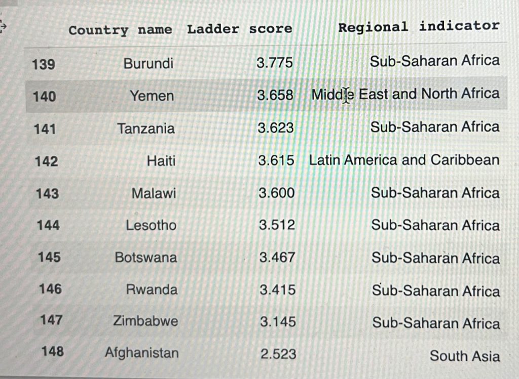
plt.figure(figsize = (20,6))
sns.barplot(data = df, x = low10['Country name'], y = low10['Ladder score'])
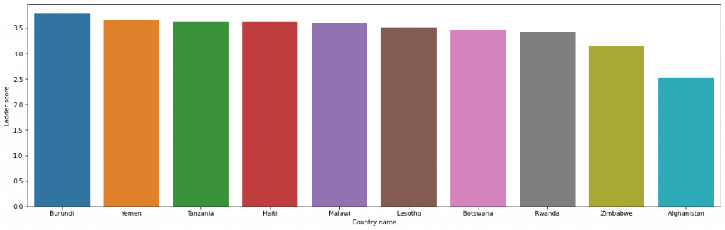
The unhappiest of the lot according to the study is Afghanistan.
Lets look at it and see the determinants of happiness and their effects in this country.
df.loc[148]

Country name                                  Afghanistan
Regional indicator                             South Asia
Ladder score                                        2.523
Standard error of ladder score                      0.038
upperwhisker                                        2.596
lowerwhisker                                        2.449
Logged GDP per capita                               7.695
Social support                                      0.463
Healthy life expectancy                            52.493
Freedom to make life choices                        0.382
Generosity                                         -0.102
Perceptions of corruption                           0.924
Ladder score in Dystopia                             2.43
Explained by: Log GDP per capita                     0.37
Explained by: Social support                          0.0
Explained by: Healthy life expectancy               0.126
Explained by: Freedom to make life choices            0.0
Explained by: Generosity                            0.122
Explained by: Perceptions of corruption              0.01
Dystopia + residual                                 1.895
Name: 148, dtype: object
[ ]
Afghanistan ranks low in all the determinants of happiness.